iOS 19 Could Get the Biggest Overhaul We’ve Seen Since 2013
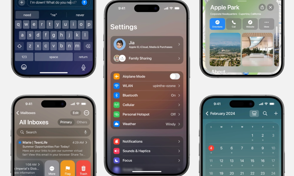
 Credit: iOS design concept / Jia
Toggle Dark Mode
If you’ve been thinking that your iPhone and iPad operating systems are feeling a little stale, you’re not wrong. While Apple adds significant new features every year, the general aesthetic of its mobile operating systems has remained fundamentally unchanged since they received their last major overhaul in 2013. However, this could be the year that changes.
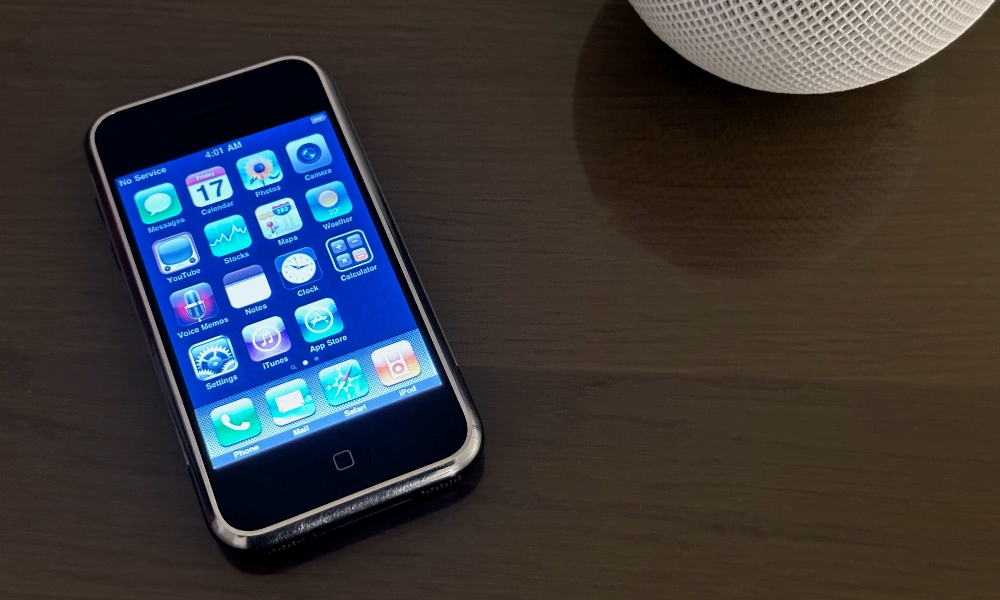
When Apple unveiled the iPhone in 2007, it featured a software platform that leaned heavily into what was known as skeuomorphic design. The apps on the iPhone, and even their icons, tended to take their inspiration from real objects. The (now-defunct) YouTube app looked like a TV, the Calendar and Contacts apps had leather accents like an old-school planner, and the Notes app used Marker Felt — a font intended to replicate pen on paper. Even the Find My Friends app had stitched leather textures.
Skeuomorphism was a hallmark of the Steve Jobs era. Apple’s late co-founder believed that mimicking real-world objects made Apple’s devices more comfortable for everyday users, and made its software approachable and familiar. While Jobs’ right-hand man, software chief Scott Forstall, shared this perspective and continued the aesthetic after Jobs’ death, the senior VP was shown the door under Tim Cook’s leadership, and software design was handed over to Jony Ive.
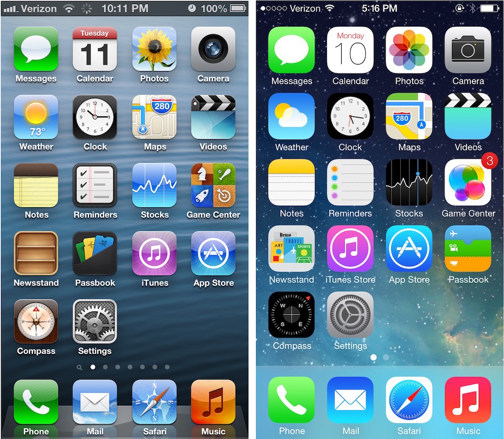
It didn’t take long for Ive to toss skeuomorphism out the window. By the time iOS 7 was released a year later, nearly all traces of the more whimsical style had been abandoned in favor of the flat design we know today.
To be fair, Apple made some refinements to this over the years. Many design and user interface experts felt that iOS 7 went too far, radically simplifying the UI to the point where it was stark and hard to read. iOS 8 and iOS 9 refined these by thickening up the fonts, using more muted colors, and blurring some of the backgrounds. Then Apple softened it some more in iOS 10 and beyond with a more card-based UI for notifications and widgets, refined animations, and the return of some subtler depth effects.
Nevertheless, these were evolutionary changes, and while iOS 18 looks significantly more polished than iOS 7, it’s clear they’re both cut from the same cloth.
However, that may be about to change. A year ago, we heard rumors that Apple was considering adopting a design inspired by the Vision Pro and visionOS for iOS 18, and while that never materialized, those reports may have simply been ahead of the curve.
Today, Bloomberg’s Mark Gurman reported that Apple is readying a “dramatic software overhaul” for the iPhone, iPad, and even the Mac. The goal is to simplify what has gradually become more complex since the halcyon days of iOS 7. That 2013 release was far more streamlined, even with its highly minimalist design, simply because there were far fewer features and apps to clutter things up.
Beyond that, Apple is also looking to create more consistency and uniformity. While iOS and iPadOS are pretty close, they’ve diverged in some subtle ways since Apple split the iPad operating system off into its own entity.
The revamp — due later this year — will fundamentally change the look of the operating systems and make Apple’s various software platforms more consistent, according to people familiar with the effort. That includes updating the style of icons, menus, apps, windows and system buttons.
Mark Gurman
Apple has also taken steps to bring macOS closer to its mobile counterparts, most notably in its 2022 macOS Ventura release, when System Preferences became a new Settings app that mimicked the iOS/iPadOS layout.
“The design is loosely based on the Vision Pro’s software,” Gurman’s sources added, echoing the rumors of a visionOS-based redesign we began hearing in late 2023. However, it’s unclear how far Apple will go down this road. Many concept mockups from that first round of reports suggested a glassy translucent UI on the iPhone and iPad that, while futuristic looking, wouldn’t necessarily help improve usability. Elements designed for a 3D spatial interface are hard to translate properly onto a two-dimensional pane of glass.
That would fly in the face of what Apple is reportedly trying to achieve with this redesign, which is to “simply the way users navigate and control their devices.” A fresh coat of paint certainly won’t hurt to keep things fresh and exciting, but that’s a secondary consideration to smoothing over the user experience.
Gurman goes on to note that Apple has code-named iOS 19 and iPadOS 19 “Luck” and macOS 16 “Cheer.” The hope is that “a breakthrough new interface can help spur demand after a sluggish stretch” in sales, which have dipped in recent years after a pandemic-era surge.
While Apple wants to make it easier to smoothly transition between macOS, iOS, and visionOS, one thing it’s not considering is merging the operating systems. The iPad will still run iPadOS and the Mac will still run macOS, and never the twain shall meet.
[The information provided in this article has NOT been confirmed by Apple and may be speculation. Provided details may not be factual. Take all rumors, tech or otherwise, with a grain of salt.]


