
9 Changes to Expect in iOS 13: Here’s a Side-by-Side Comparison with iOS 12
 Credit: Instagram / phonerebel
There’s a lot coming in iOS 13 — so much that Apple was only able to cover the highlights when it first unveiled it last month, glossing over dozens of other new features. However, even though the beta versions have been available to both developers and public beta testers for at least a couple of weeks now, it’s difficult to fully appreciate exactly how much has changed between the two versions without actually looking at them side-by-side.
Hence, UX Designer Ryan Burnett has done exactly that, providing a series of tweets that show screenshots of the same screens on both iOS 12 and iOS 13, giving us a real appreciation for some of the really cool but subtle refinements in Apple’s upcoming iOS 13 release — and there’s quite a lot there. Read on to see all of the comparisons from the old to the new…
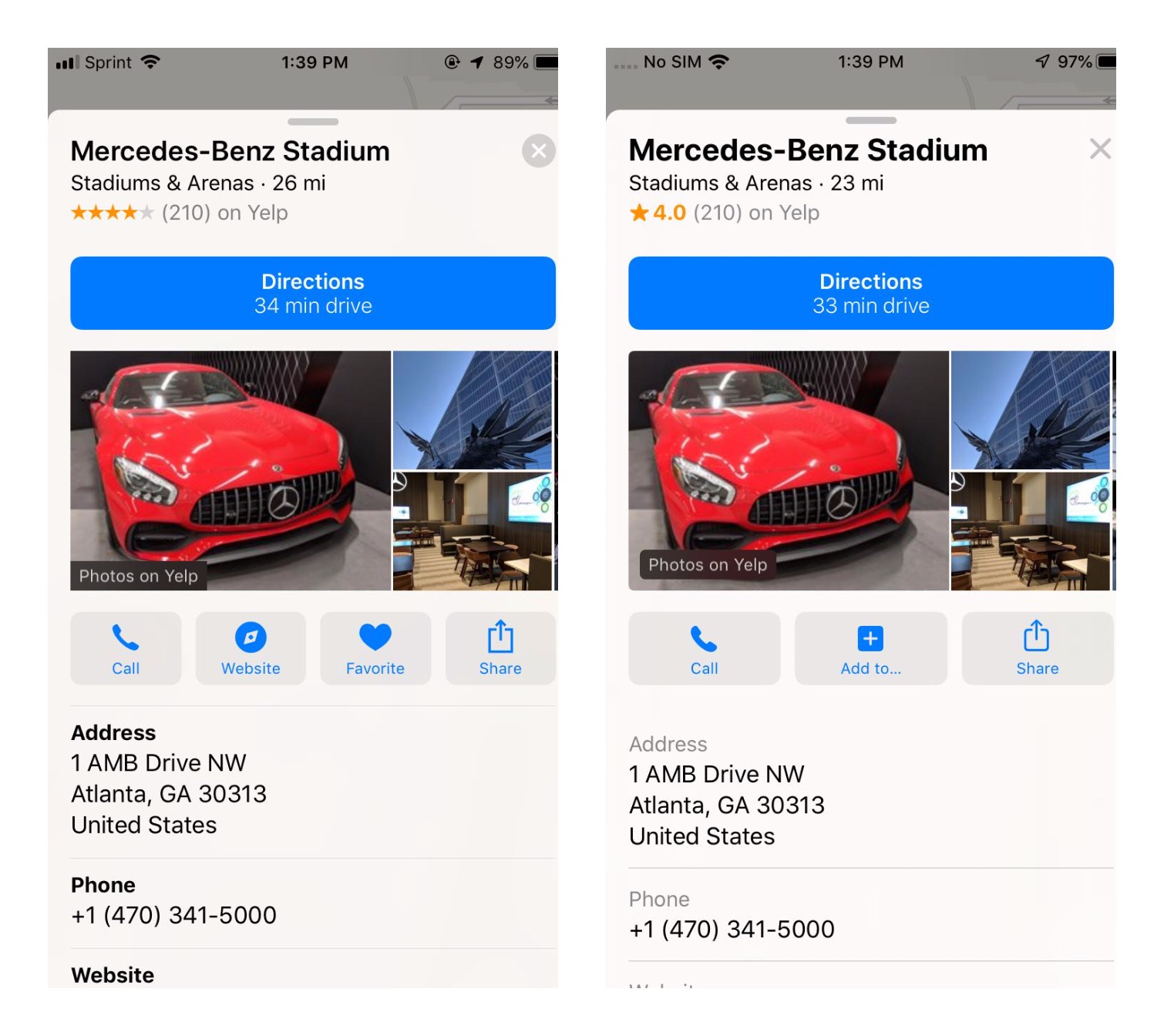
Share Sheets
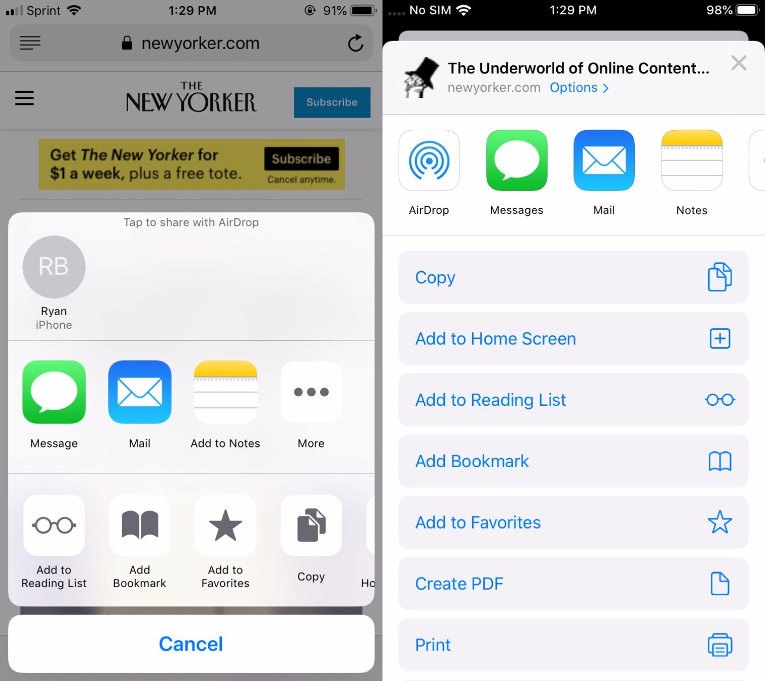
There have been a lot of interesting changes in Safari, and Burnett specifically uses it to highlight the new iOS 13 Share Sheet design, which adds suggested sharing recipients and methods in the top row, replacing the old list of AirDrop targets, which has now been moved down to an icon in the second row, alongside other sharing destinations like Messages and Mail. The final “Actions” row is now presented as a vertical list of menu options, rather than a horizontal row of buttons.
There have been a lot of interesting changes in Safari, and Burnett specifically uses it to highlight the new iOS 13 Share Sheet design, which adds suggested sharing recipients and methods in the top row, replacing the old list of AirDrop targets, which has now been moved down to an icon in the second row, alongside other sharing destinations like Messages and Mail. The final “Actions” row is now presented as a vertical list of menu options, rather than a horizontal row of buttons.
More specifically, the Share Sheet now gets the title of the current page, reminding users what they’re actually sharing, along with an “Options” button that can be used to change the way the content is shared — such as sending a link, a PDF file, or a web archive.
While Burnett uses Safari as his example, this new Share Sheet design is used throughout iOS 13, and the “Options” button is context-aware in other apps as well, such as in the iOS 13 Photos app, where users can choose whether to include location data and full-resolution original versions when sharing photos.
Safari
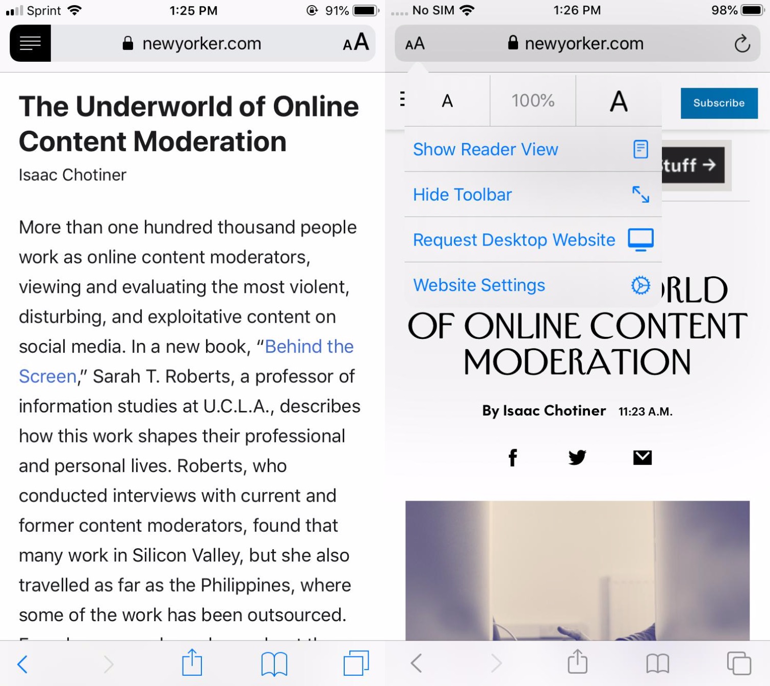
Digging more into Safari itself, Burnett points out how the old “Reader” icon has been updated to an “AA” icon that now displays a menu of options that include Show Reader View, along with others that were previously buried in the Share Sheet actions, such as Request Desktop Website. The refresh button also now does double-duty, bringing up the “Copy/Paste” pop-up menu to make it easier to grab the link for the current page, or paste something new into the address field.
Under Website Settings, iOS 13 will now allow users to specify per-site options, such as whether Reader should automatically be used, whether a desktop website should be requested instead of a mobile one, whether any installed content blockers should be active, as well as controlling camera, microphone, and location privacy. All of these settings were available in previous iOS versions, but they were scattered throughout the main Settings app; this is a much more intuitive and user-friendly way to get access to them all in one place.
Burnett also notes that iOS 13 has also improved the contrast of the Bookmarks, Reading List, and History tabs, and it’s worth noting that like many of the other new sub-menu screens in iOS 13, these now come up as an overlay “card” that can be easily swiped down to return to the main Safari page, rather than being shown as a separate screen — a very cool UI touch that makes the entire iOS 13 experience feel more natural and fluid.
Markup and Full-Page Screenshots
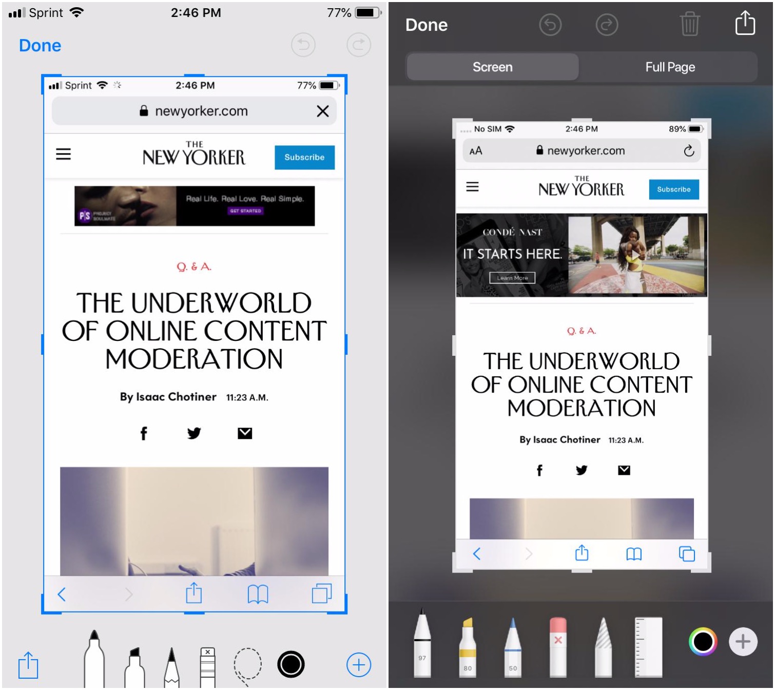
The screenshot interface in iOS 13 gains a few really slick improvements, which most notably include the ability to now take full-page screenshots in supported apps.
For example, in Safari, instead of just taking a shot of what you can see on the screen, you can tap a “Full Page” option at the top of the screenshot UI to capture that entire web page, including all of the parts that are out of view. When in full screen mode, a thumbnail of the entire long page appears on the right, with the ability to scroll up and down the page.
This also works in at least some other apps like Mail that often have content out of view, but it’s not quite as universal as you’d expect — for example it doesn’t yet seem to be present in Apple’s own Notes app, and it’s unclear exactly how it will work with third-party apps.
The markup screen tools are also now much more colourful and more detailed, and a trashcan icon appears in the top right corner allowing you to quickly delete a screenshot. When saving a standard screenshot, you can also now choose to save it straight to the iOS 13 Files app instead of just the photo library. On the other hand, the new “Full Page” screenshots can only be saved to PDF files, at least for now.
The Volume Bar
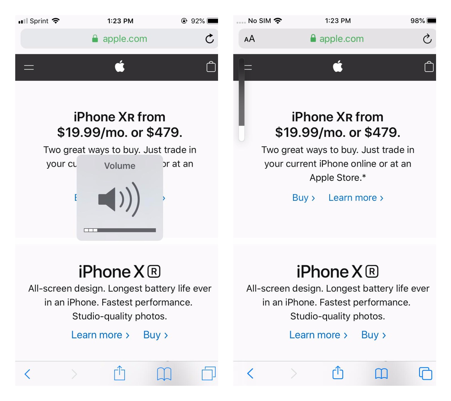
It’s already old news that iOS 13 finally ditches the overlaying bezelled volume indicator that’s been used since the original iPhone, replacing it instead with a much more subtle bar that appears at the top-left when adjusting the volume — logically right beside the volume buttons.
As a nice added touch, while the new volume bar is on-screen, you can also tap on it and slide up and down with your finger to adjust the volume more directly.
Location Access
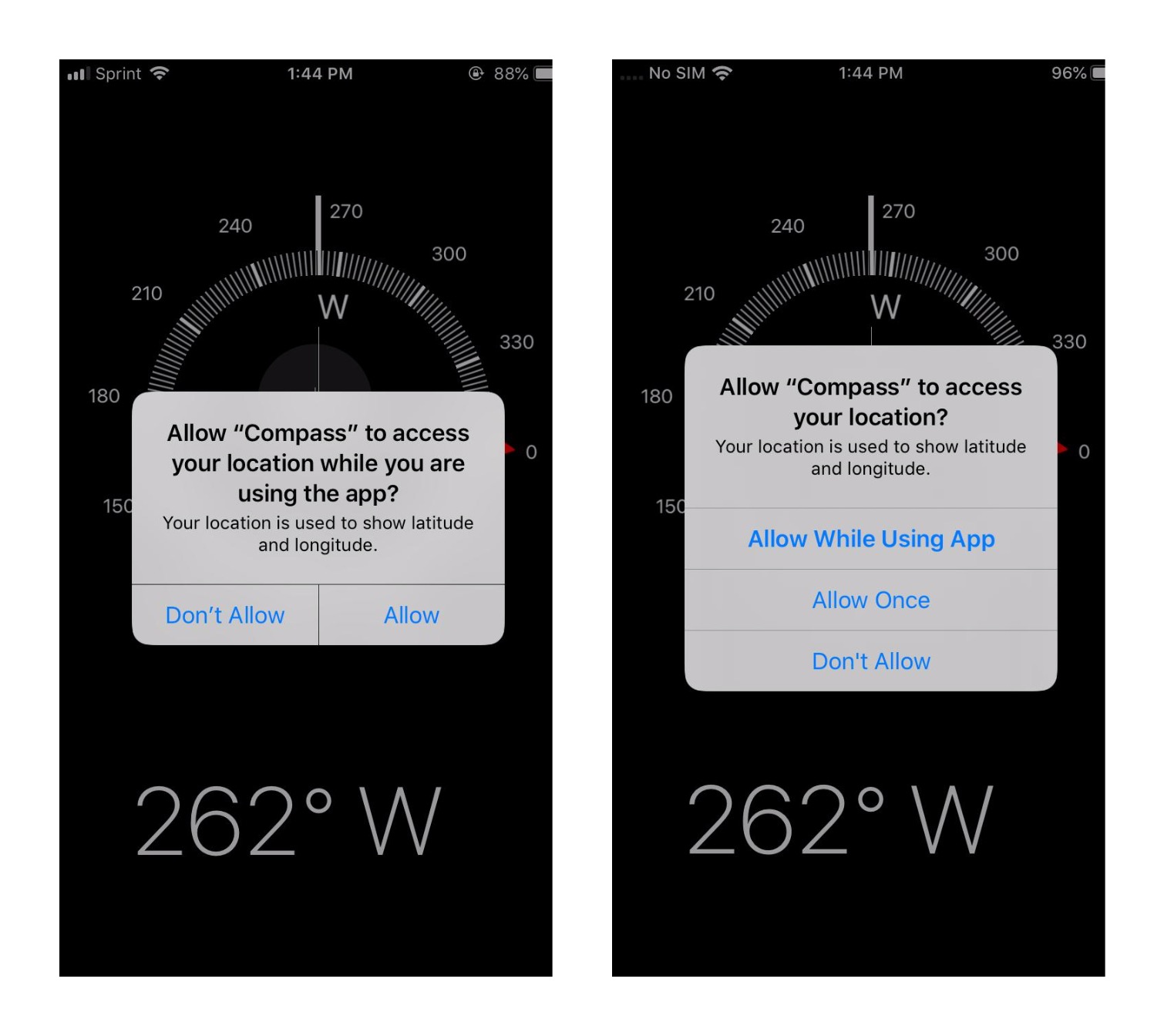
With Apple’s continuing emphasis on user privacy, iOS 13 uses a new popup when asking for location access that provides an “Allow Once” option, which grants the app only one-time access to your current location without opening it up to more invasive tracking.
This can be particularly useful in situations where an app simply needs to look up your location during initial registration — to find your ZIP code, for instance — but shouldn’t have any legitimate need to access it after that.
Find My
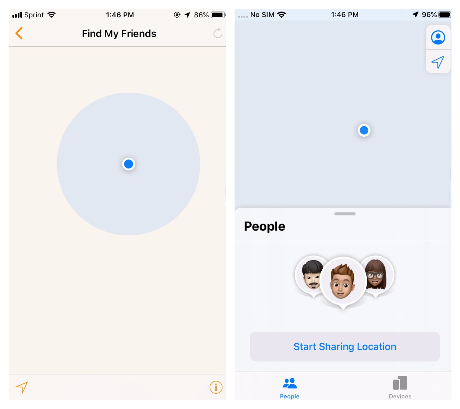
It’s the app with an annoyingly dangling preposition, but Apple’s new Find My app combines the functions of Find My iPhone and Find My Friends, and we’re guessing Apple just couldn’t decide on a good object for that sentence, so they just left it hanging.
Grammatical fussiness aside, Apple has done a nice job with the new app, which gets a much more polished UI than its individual predecessors and a smoother onboarding experience for new users.
Messages
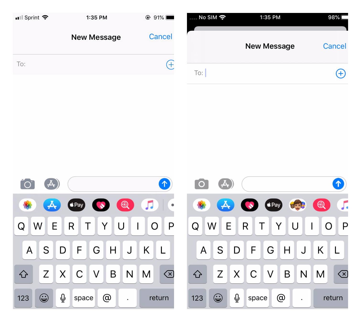
The new “card” design mentioned earlier is also used when starting a new message in the Messages app, allowing it to be swiped down and away if the user changes their mind, while also cleverly hiding the iPhone X-series notch by going all black at the top.
Unlike Mail, however, the card design doesn’t let you start a message as a draft. Swiping the card away will discard the new message, rather than just pinning it at the bottom of the screen. We still like the more consistent UI, though.
iOS 13 Messages also gets an improved search feature, along with the ability to now specify a name and picture that can be shared with other iMessage users (but only if they’re also running iOS 13 or macOS Catalina).
Maps
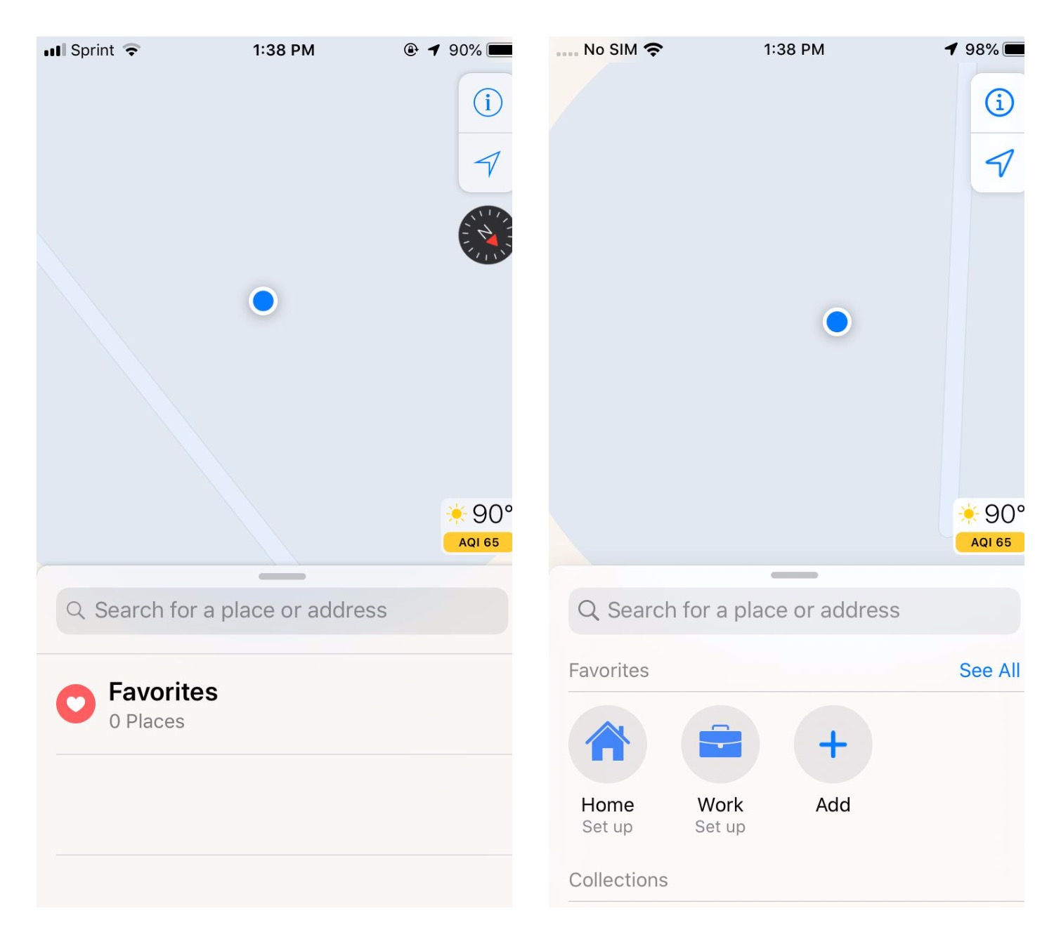
There have been a lot of interesting and subtle changes to Apple’s Maps app, which for our money is still the better choice than Google Maps — it’s more integrated and has a far cleaner UI and focused design than Google’s increasingly cluttered mess — and it’s only getting better in iOS 13.
The compass indicator is now hidden whenever the map is oriented north, which is the default orientation unless you’ve manually adjusted it. Home and Work are also now showing in favourites, which appears as a horizontal row of icons below any Siri suggestions. Below that is the new Collections section, then followed by the list of recently viewed places.
Location cards have also been polished up nicely, with bolder headers, numeric ratings, and bigger buttons, along with several other more subtle but overall nicely done UI changes.
Photos
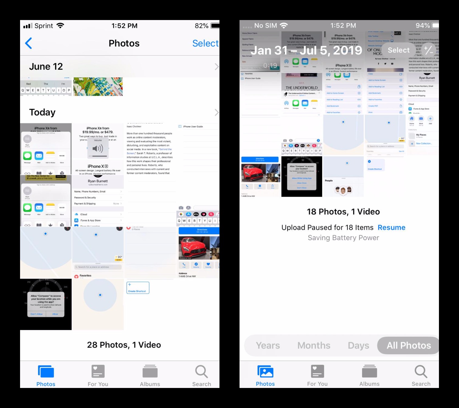
Another surprisingly big UI change is found in the iOS 13 Photos app, which now goes full-screen, eliminating the standard header with a scrolling view that goes right up into the status bar and notch area and simply overlays the title text and a pair of “Select” and zoom buttons. It’s a gorgeous new UI for Apple’s modern X-series iPhones.
The zoom buttons are particularly cool, allowing for a range of five different thumbnail sizes, from what is essentially a mosaic right up to a full-width view. Pinch-to-zoom also works here for zooming in and out too. To be fair, Google Photos did this first, but as usual Apple has implemented it in a much smoother, more attractive, and more natural way.
A bar at the bottom also allows the user to choose from three “Curated” library views: Years, Months, and Days, and as a cool added touch, you can move between these three views using pinch-to-zoom gestures as well, zooming in to get more granular (e.g. years to months to days), or zooming out to move in the other direction.