
More Changes to the Feels Like Panel and Charts
Feels Like is getting a couple of other changes, too.
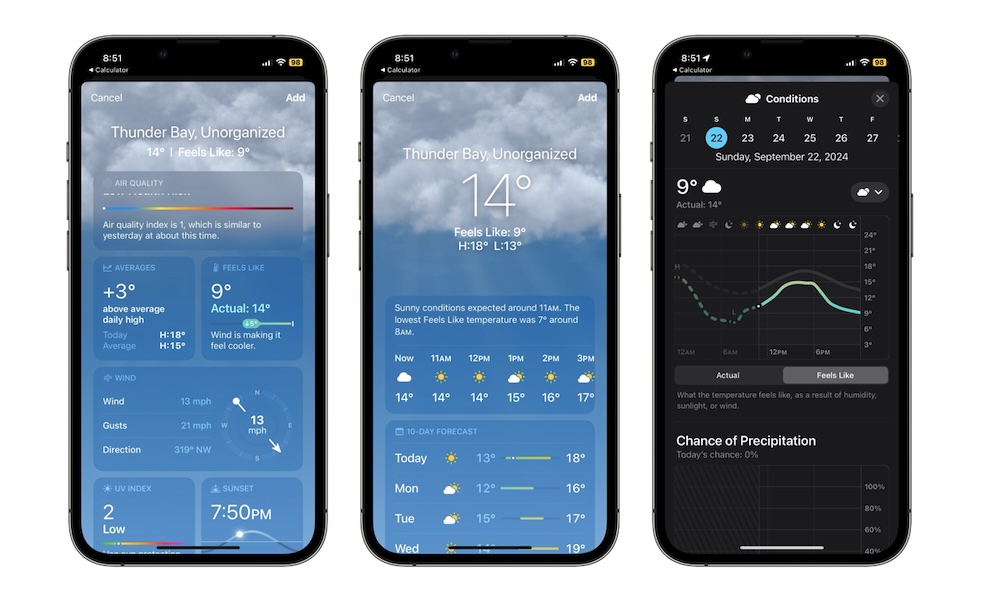
For starters, the Feels Like panel that you find when you scroll down the Weather app now shows a bit more information. Before it would only show you the temperature that it felt like instead of the actual temperature, but with iOS 18, you’ll also see the current temperature, so it’s easier to appreciate the difference between them.
This doesn’t happen every time. Like the previous change we mentioned, this will only appear if the difference is noticeable.
Another change is in the Feels Like chart. Now, when you tap the Feels Like panel, you’ll go directly to the Conditions chart, which used to be a separate chart.